I am very happy to let you know that, together with my dear colleagues Dirma Janse, Maarten van der Sanden and Martijn van Overbruggen, we recently published a perspective paper in Frontiers in Bioinformatics.
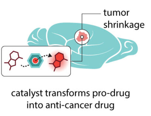
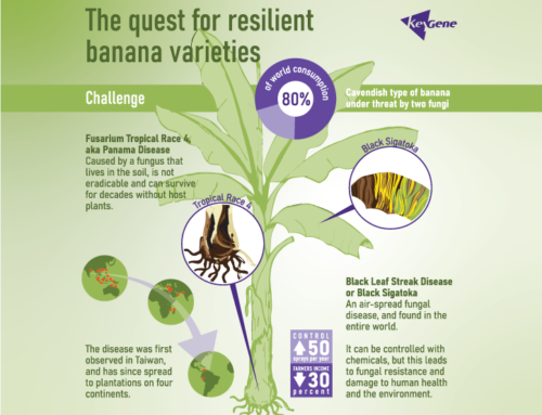
Scientific conferences are packed with brilliant ideas. Yet much of that knowledge is lost in cognitive overload, dense slides, and inaccessible visuals. Our paper discusses how scientific visuals and infographics can move beyond information display — and become tools for dialogue, shared understanding, and collaboration.
Our core message is simple:
👉 Good visuals don’t just explain.
👉 They invite conversation.
👉 They help diverse audiences think together.
The paper connects:
- cognitive science and visual perception
• graphic design principles
• audience diversity at conferences
• and practical design strategies for infographics and presentations
We argue that when visuals focus on clarity, coherence, and inclusivity instead of detail and technical sophistication, presentations shift from one-way delivery to collective sense-making.